What is Data Visualization?
Data visualization is one of the most effective methods for insight and storytelling in the rapidly growing field of data science. Information and data are represented graphically in data visualisation. It converts big and complicated datasets into a format that is simple to understand by utilising visual components like maps, graphs, and charts. Patterns, trends, and connections that could be missed in raw data are shown by these visualizations.
In a nutshell, it serves as a link between comprehension and data analysis.
Why is Data Visualization Important?
Context-free data is merely noise. By giving data context and meaning, visualisation helps audiences of all skill levels understand difficult ideas.
Here’s why data visualization is essential:
Simplifies complex data: Makes it easy to interpret large datasets at a glance.
Reveals patterns and trends: Highlights correlations and outliers that might not be obvious in raw data.
Supports faster decision-making: Visual summaries allow for quick, data-driven insights.
Enhances storytelling: A compelling graph can make your message far more impactful than a wall of text.
Promotes data literacy: Encourages more people in organizations to engage with data confidently.
Types of Data: Categorical vs Numerical
In Data Visualization, It’s critical to comprehend the kind of data you’re dealing with before developing a visualisation. Which chart or graph you choose depends on the type.
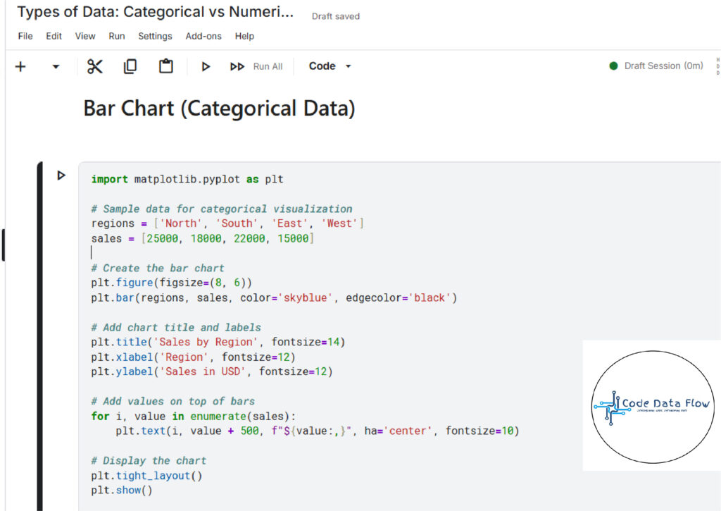
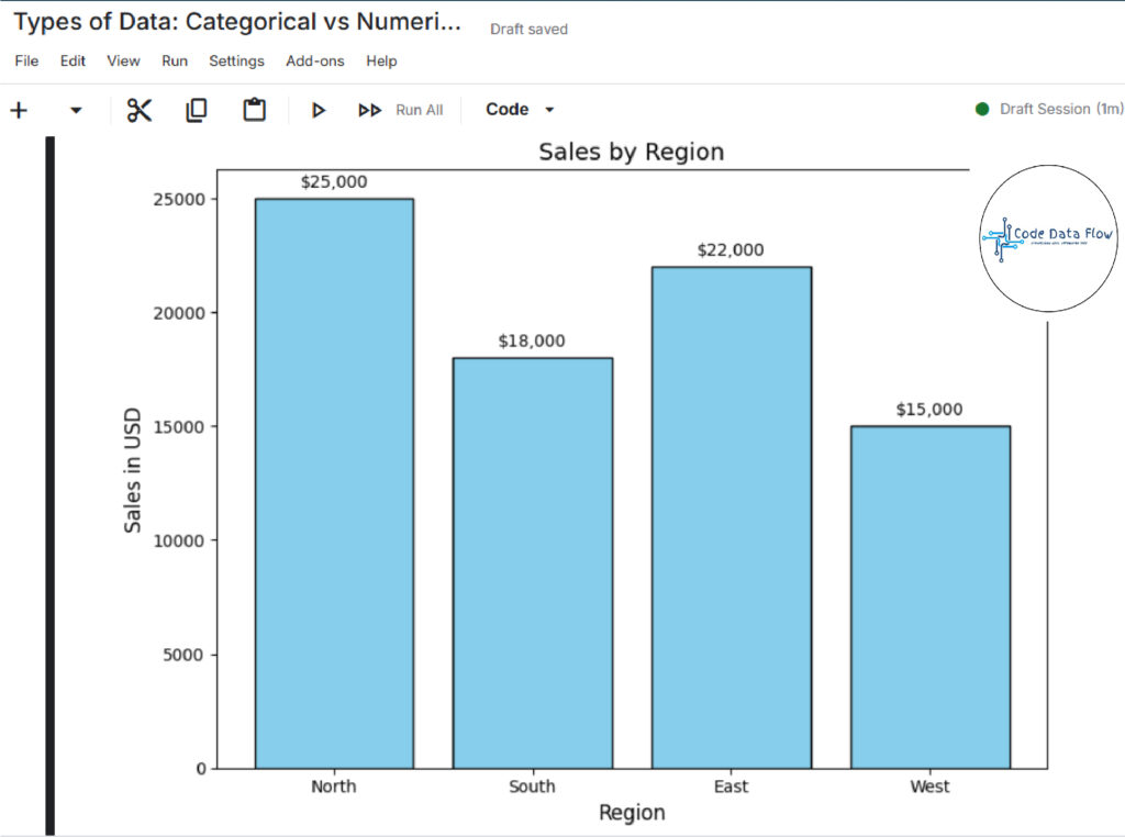
- Categorical Data:
Categorical data represents groups or categories. It can be:
- Nominal: No natural order (e.g., colors, gender, country)
- Ordinal: With an inherent order (e.g., education level, satisfaction rating)
Best visualizations: Bar charts, pie charts, stacked columns.
OUTPUT:
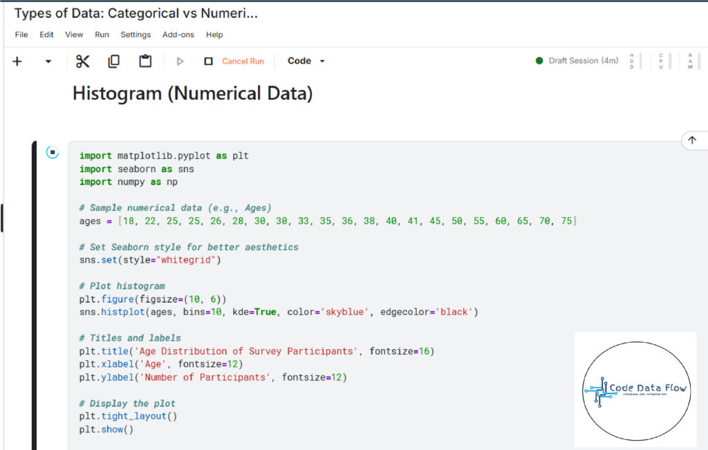
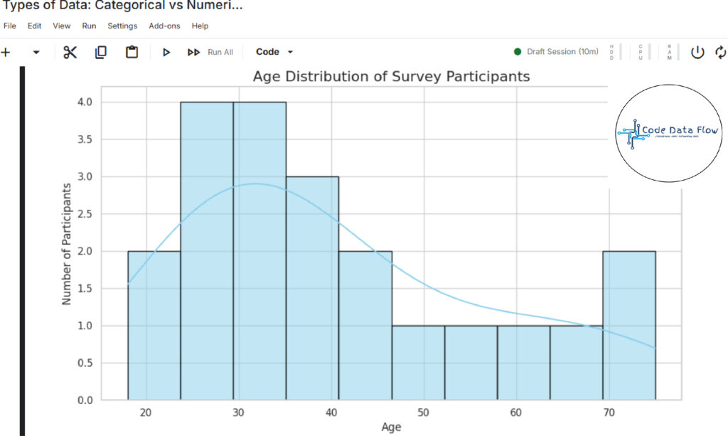
2. Numerical Data:
Numerical (quantitative) data represents values that can be measured or counted. It can be:
- Discrete: Countable (e.g., number of students)
- Continuous: Measurable (e.g., height, temperature)
Best visualizations: Histograms, line charts, scatter plots.
OUTPUT:
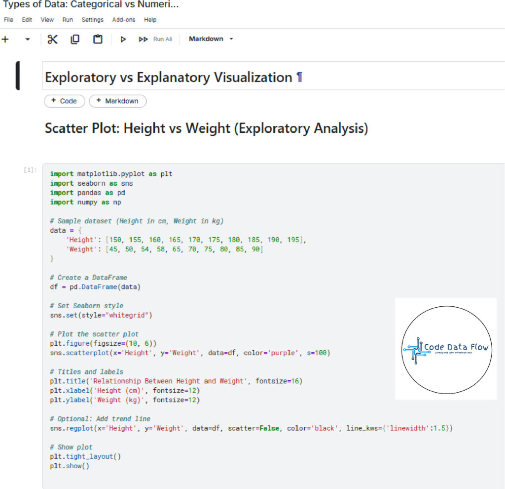
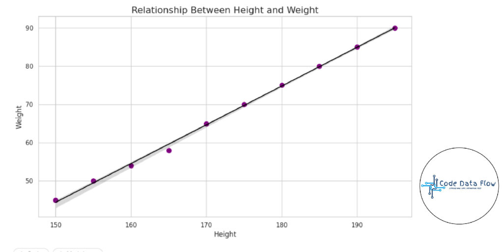
Exploratory vs Explanatory Visualization:
Understanding the goal of your visualization helps decide its design and structure.
- Exploratory Visualization
In Data Visualization, it is used to find trends, identify irregularities, or test theories while analysing data. Data scientists and analysts frequently utilise it when they are first exploring data.
Characteristics:
- Interactive and flexible
- Often messy and experimental
- Helps you understand the data
Examples: Scatter plots to check correlation, box plots to explore distribution.
OUTPUT
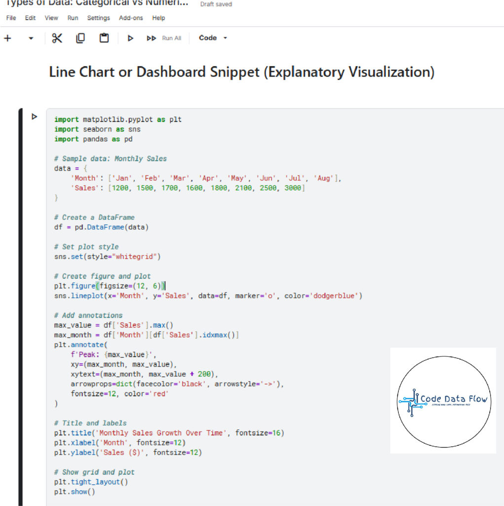
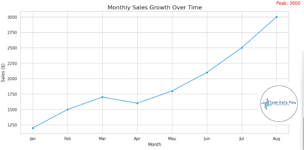
2. Explanatory Visualization
used to convey certain insights to a group of people. Storytelling is the aim, and highlights and commentaries are frequently used.
Characteristics:
- Clean and polished
- Highlights a specific takeaway
- Tailored for decision-makers
Examples: Infographics, dashboards, summary charts in reports.
OUTPUT:
7 Key Concepts to Understand Data Visualization for Beginners
Creating effective visualizations isn’t just about choosing the right chart type — it requires thoughtful design. Here are some key principles:
- Know Your Audience:
Tailor your visuals based on your viewers’ familiarity with the topic. A data scientist might appreciate detailed plots, while an executive might prefer high-level insights.
2. Choose the Right Chart Type:
The function must be followed by the form. Line charts are excellent for showing patterns over time, while bar charts are useful for comparisons.
3. Keep It Simple:
Avoid clutter. Every color, line, or label should have a clear purpose. Minimalism improves focus and clarity.
4. Use Color Wisely:
While colour can draw attention to important information, it shouldn’t overpower. Make use of relevant and consistent colour schemes, particularly when separating groups or categories.
5. Tell a Story:
Each chart should provide a message or an answer to a query. Show insight instead than just numbers.
6. Ensure Accuracy:
Steer clear of cherry-picked statistics or deceptive scales. Your reputation rests on maintaining visual purity.
7. Annotate Key Points:
To clarify key elements of the chart, use labels, highlights, or succinct text. This lessens the cognitive strain and makes it easier for viewers to follow along.
Final Thoughts
Effective data visualisation is a communication superpower in the data-driven world, not just a technical ability. A well-designed visualisation may be the key to gaining insight and motivating action, whether you’re examining climate data, user behaviour, or sales success.