Charts, graphs, and maps are used in data visualisation to display information in an understandable and straightforward manner. It transforms complicated data into easily understood images.
Every sector has vast volumes of data, and visualization makes it easier to see patterns and trends rapidly, enabling quicker and more informed decision-making.
Common Types of Data Visualization
There are various types of data visualizations where each has a unique purpose in data representation. Here are the most common types:
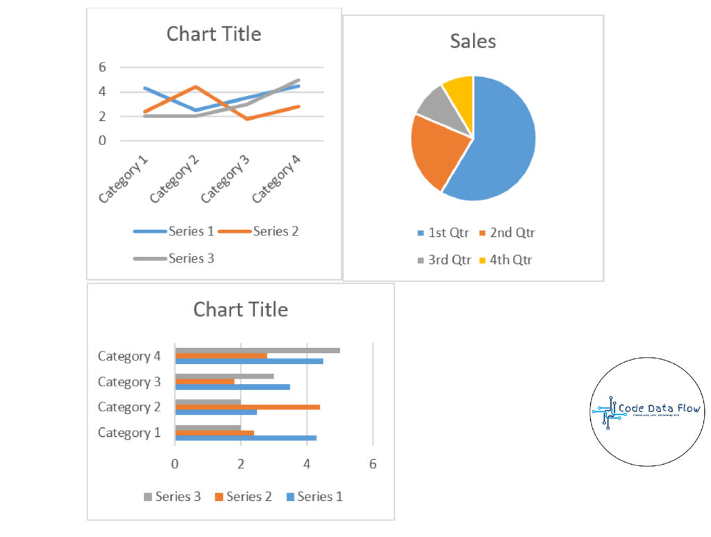
- Charts and Graphs: They are used to visualise data; graphs examine the relationships between variables to find correlations, trends, and outliers; charts compare data points across categories or display patterns over time. Examples include box plots, scatter plots, histograms, pie charts, bar charts, and line charts.
- Maps: They are employed to show geographic data, which gives patterns and trends a spatial context. Examples include heat maps and geographic maps.
- Dashboards: They integrate several visualisations into one interface, offering users interactive tools and real-time insights to examine data.
Importance of Data Visualization:
Data visualization is essential for understanding and communicating information effectively. Here are some key reasons why it’s important:
- Simplifies Complex Data: Large datasets can be overwhelming in raw form. Visualization techniques like charts, maps, and dashboards simplify this information and make patterns immediately visible.
- Improves Understanding: Images are processed by humans far more quickly than words or statistics. Stakeholders can more easily understand trends, correlations, and outliers with the use of graphs and graphics.
- Supports Better Decision-Making: When data is displayed visually, decision-makers can more easily recognise risks, opportunities, and performance gaps, resulting in timely and well-informed decisions.
- Reveals Hidden Patterns and Trends: Data visualization uncovers insights that may remain unnoticed in spreadsheets, such as seasonality, geographic distribution, or anomalies.
- Enhances Communication: Visuals ensure that everyone understands the same information because they are easier to share and more engaging for both technical and non-technical audiences.
- Saves Time: Instead of analyzing long reports, interactive dashboards and visuals enable quick exploration and interpretation of data.
- Drives Engagement:Well-designed visualizations capture attention and make data-driven storytelling more compelling for presentations, research, or business reports.
Real-World Use Cases for Data Visualization
- Business & Finance
- Tracking sales, revenue, and profit with dashboards.
- Visualizing customer behavior and purchase trends.
- Fraud detection by spotting anomalies in transaction patterns.
2. Healthcare
- Monitoring patient health data (e.g., heart rate, glucose levels) through dashboards.
- Tracking disease outbreaks (like COVID-19 spread maps).
- Visualizing medical imaging data for diagnosis support.
3. Education
- Student performance analytics (grades, attendance, progress trends).
- Interactive dashboards for school management and curriculum planning.
- Identifying learning gaps and outcomes.
4. Government & Smart Cities
- Tracking population growth and census data.
- Crime mapping for law enforcement.
- Urban planning through geographic visualization of infrastructure and housing.
5. Science & Research
- Climate change visualization (temperature rise, CO₂ emissions, sea-level changes).
- Genomic data visualization in bioinformatics.
- Visualizing astronomical data for space research.
6. Technology & Internet
- Website traffic visualization (Google Analytics dashboards).
- Social media engagement trends (likes, shares, comments).
- Cybersecurity threat detection using real-time network visualizations.
7. Sports & Entertainment
- Player performance analysis in football, cricket, or basketball.
- Audience engagement tracking for TV shows and streaming platforms.
- Event ticket sales visualization.
8. Transportation & Logistics
- Flight and shipping route tracking in real-time.
- Supply chain performance dashboards.
- Traffic congestion and accident heatmaps.
Challenges in Data Visualization
- Data Quality: Accuracy of visualizations depends on the quality of the data. If the data is inaccurate or incomplete, the insights from the visualization will be misleading.
- Over-Simplification: Simplifying data too much can lead to important details being lost like using a pie chart that oversimplifies complex relationships between categories.
- Choosing the Right Visualization: Using the wrong type of visualization can distort the message. For example, a pie chart might not work well with many categories which leads to confusion.
- Overload of Information: Too much information in a visualization can overwhelm viewers. It’s important to focus on key data points and avoid clutter.
Best Practices for Effective Data Visualization
To ensure our data visualizations are impactful and easy to understand we follow these best practices:
- Audience-Centric Design: Tailor visualizations to our audience’s knowledge. A technical audience may need detailed graphs while a general audience benefits from simpler charts.
- Design Clarity and Consistency: Choose the right chart for our data and keep the design clean with consistent colors, fonts and labels and also avoid clutter to ensure clarity.
- Provide Context: Always provide context by including labels, titles and data source acknowledgments. This helps viewers to understand the significance of the data and builds trust in the results.
- Interactive and Accessible Design: Make visualizations interactive with features like tooltips and filters and ensure accessibility for all users regardless of device or visual needs.
For more details refer to Types of Data Visualization